

brief
A successful hydroponic farm located in Sharjah has been providing fresh and healthy produce to various local retailers for some time now. With a desire to expand their market and sell directly to consumers, the farm recognized the opportunity to create a new brand that would reflect their vision for the future. Although their old brand had served them well, they knew that it was time for a change. By creating a new brand, the farm was able to better localize their business, update their image, and better communicate their values to their customers.
client
Themar Al Emarat
involvment
Branding, Creative Direction, Packaging
year
2021
initial exploration
during the initial inquiry, I started with a word cloud that my client and I came up with. Any words of relevance to the farm and to their vision were included. I then began to draw icons that would combine one or more words within it.
I used imagery from their website to populate a color grid I can start playing with.
Then I challenged myself to come up with as many vegetables as I can with one shape. The mushroom and tomato-apple looking thing won unfortunately.
After the first review, the exploration lacked the most crucial element which was localization. So by using the same shape and repeating it over its axises the new icon was born.

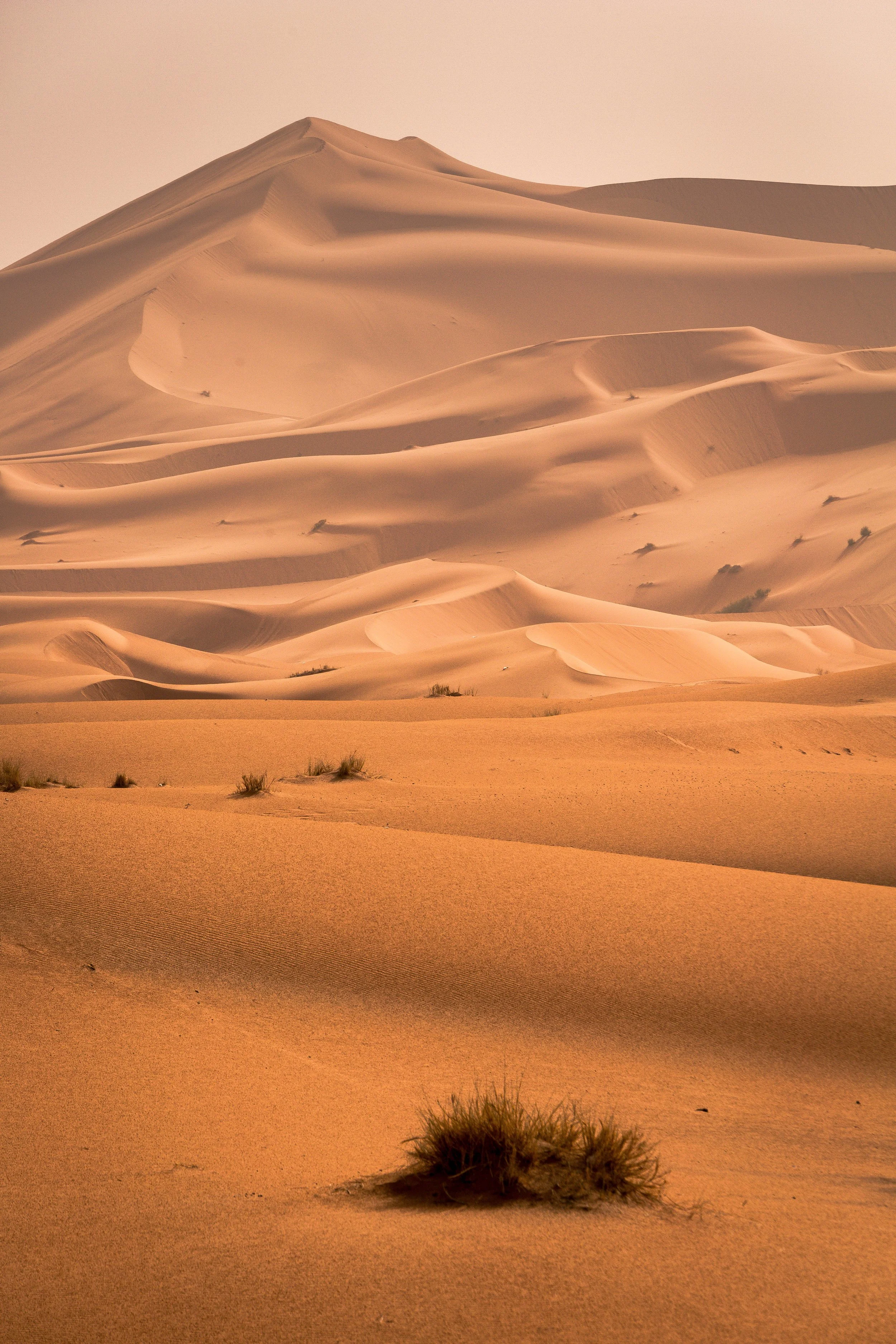

The new brand created incorporated dunes and vegetation to reflect the idea of growing edible plants in the desert of Sharjah. The visual style was taken from Sharjah's inclination and fascination with Islamic art and architecture. The icon is formed by using circular forms and the negative space created from them to assemble both the dunes and the vegetation growing in the middle.
To create a visual identity that was both modern and traditional, the brand used a mix of modern and traditional design elements. The typography and colors were traditional, while the layout and iconography were modern.


Typography
since this is a bilingual company, the logo type was explored using calligraphy and a latin and Arabic based font.
we arrived at a combination that mimicked the corners of the icon. both latin and Arabic characters have similar slanted features and overall gave a more solid presence to the brand.


