
brief
As a creative lead in the Prime Minister's Office's Government Leadership Programme, I was tasked with a rebranding proposal for the programme that had been running for the past eight years. The programme's vision had been updated, and I was part of a fully upgraded team, making it the perfect time to update the visual language of the programme to reflect its new purpose. The vision of the programme is to enable and discover leaders across multiple sectors, including federal, local, and private, and the rebranding was aimed at bringing the programme up to date and better aligning it with its new vision. This was my first project on the job, and it was definitely a journey, requiring me to learn new skills and strategies along the way.
client
Ministry of Cabinet Affairs
involvment
Branding, Creative Direction, Product Design, Social Media Marketing, Visual Identity
year
2018-2022
a trip down memory lane
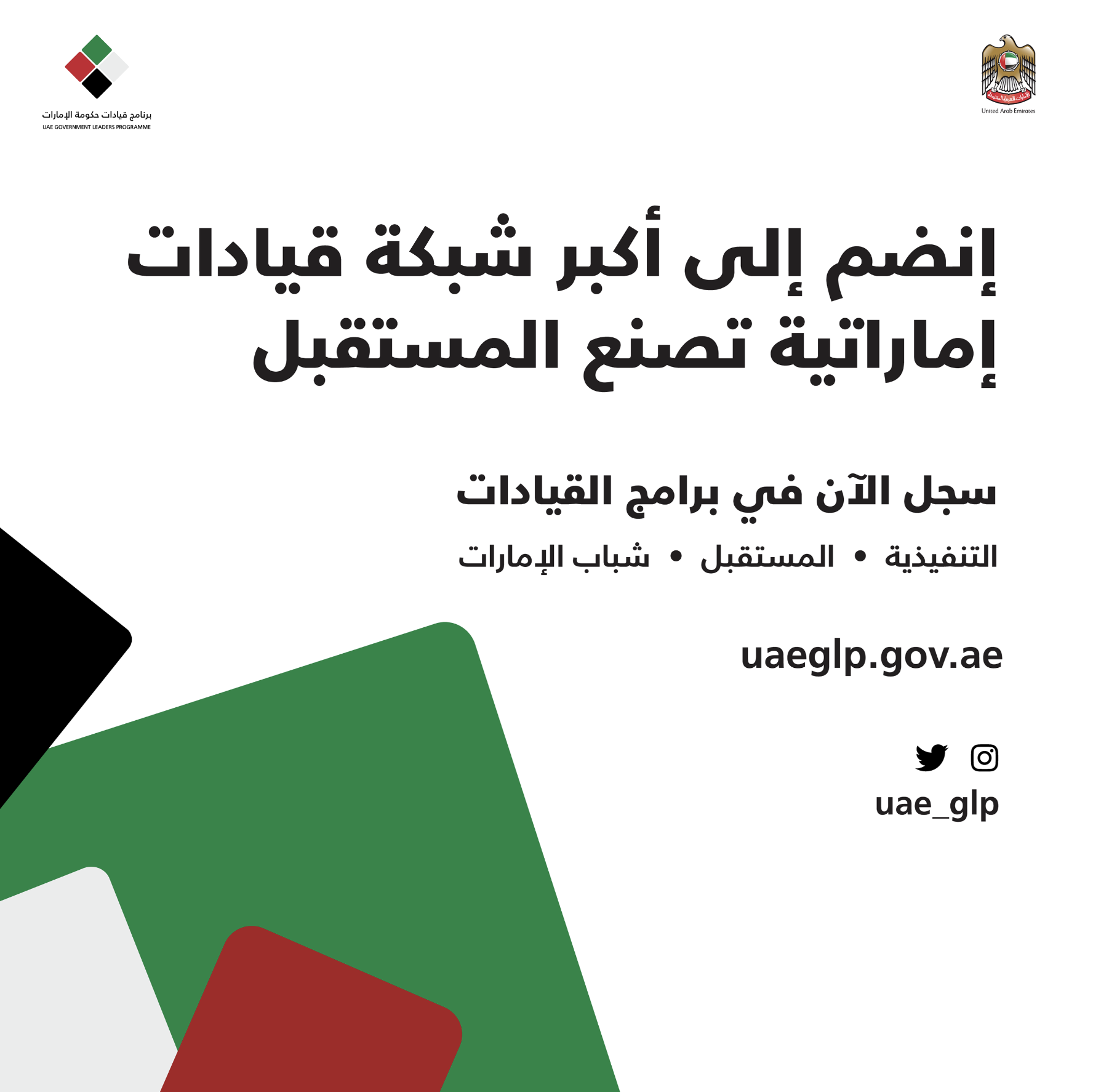
What I started with was a logo they’ve had for the past 8 years. According to my analysis, the multiple shades included in the logo needed refinement. The typography is reminiscent of old government agencies and doesn’t fully allow for the brand to step into the future.

Analysis
2.
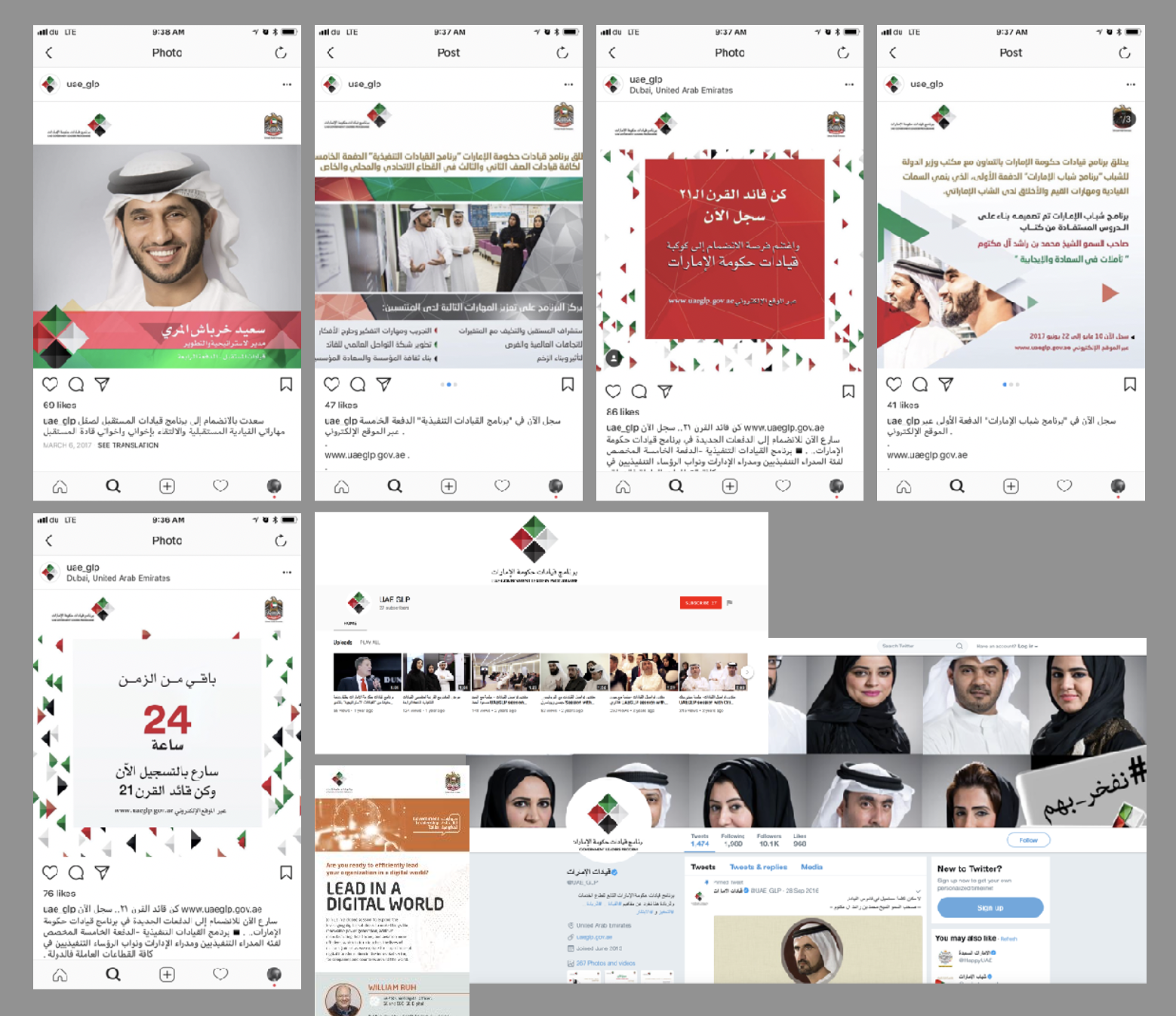
a thorough review of its digital presence revealed the history of the brand. With every change internally, the brand changes externally, which is not uncommon for brands that exist in the corporate sphere.

1.
colors were very important, as they were part of the national brand. The usage of the colors of the flag were a part of their identity which they didn’t want to give up. So I limited the colors, removed the gradients and just used flat colors.